Design··4 min read
Dark Mode Done Right: Accessibility Beyond Aesthetics
[Example] How to implement theme switching that works for every reader — with sufficient contrast in both modes.
E
Example Author
[Example Author]
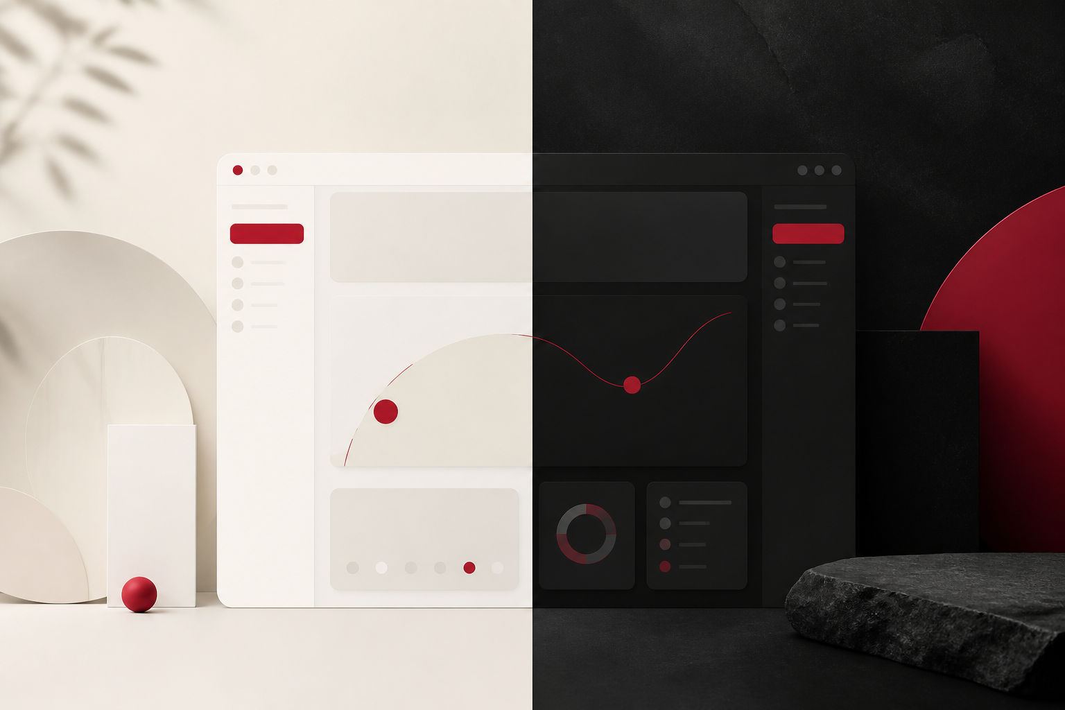
[Example introduction] Dark mode isn’t a trend — it’s an accessibility feature. But poorly implemented dark themes create as many problems as they solve.
Contrast ratios that matter
Both light and dark modes in Chronicle meet WCAG AA standards for normal and large text. Accent colors are tested against both backgrounds.
System preference support
[Example text] Chronicle respects prefers-color-scheme and persists user choice in localStorage. No flash of wrong theme on page load.
Common pitfalls
- Transparent overlays on mobile menus — Chronicle uses solid backgrounds
- Low-contrast muted text — our muted colors maintain readability
- Forgotten border colors — borders adapt in both themes via CSS custom properties
Conclusion
[Example text] Good dark mode is invisible. Readers simply enjoy content comfortably, regardless of their preference or environment.